"Plans are only good intentions unless they immediately degenerate into hard work !"
(Peter Drucker)

Sunday, November 7, 2010

Words and Images in Mom's Cancer by Brian Fies

Mom’s Cancer is a Comic book by Brian Fies that blends together words and images to describe the author mom’s battle with lung cancer, as well as the hard times that his family is going through. In this powerful book, words and images are used to express emotions, sadness, deep fears. Through the juxtaposition of words and visual elements, the readers are drawn into the world of Brian Fies, joining and being close to his family in the hard times they are going through.
The book cover is a cartoon symbolizing his mom. The panel has been cut in a half, to express the fact that the world of cancer patients is somehow double because many times their brain is sometimes in a different world compared to their body.
This comic book does a great job at expressing the effect and the powerful composition resulted when words and images are used together.  The style adopted by Fies gives him the ability to express the passage of time, different actions, scenes, people, emotions, states of mind, or places. For example to show that his mom’s health is worsening, he is portraying her in a sequence from having hair, to less hair, until finally all her hair is gone. All this transitions is on the same page.
The video below is an interview with Brian Fies for the Rockweel Museum in which the author states the story behind the scenes of Mom's Cancer. 
Sarcasm and irony are also used to express serious family matters and issues and involve the reader body and soul.  
Mom’s Cancer won the Eisner Award in 2005 for best Digital Comic Book, and after it was published in 2006, many other awards were to come.


To find out more information about Brian Fies and his latest Comic Books, check out his blog at: http://momscancer.blogspot.com/.

Monday, November 1, 2010

The Design Process - Scott McCloud's version

In Understanding Comics: The Invisible Art, Scott McCloud defines the design or the creative process as being a “path consisting of six steps” (McCloud, 170). McCloud argues that idea, form, idiom, structure, craft and surface are at the base of design, and at one point or another each designer goes through and follows these steps to achieve a harmonious and successful composition.
In McCloud’s version, the idea or purpose is the first stage in the design process. He defines it as being the “impulses, the ideas, the emotions…the work’s content.”  From this definition, we deduce that everything starts with an idea. Idea is the base of design. During the design process this initial idea can, however, be modified.
Form , the second step in McCloud’s version, is basically the visual aspect of the work. It can be a painting, a drawing, a comic book, a sculpture.
The third stage is the idiom, and it is defined as “the school of art, the vocabulary of styles or gestures or subject matter, the genre that the work belongs to… .” Depending on its idea and characteristics, design may be classified in different categories.
Structure, as McCloud defines it means putting it all together…what to include, what to leave out…how to arrange, how to compose the work. The composition and the organization in a coherent manner  plays a significant role in the design process. First thing to be taken into account is the audience that the work is going to be addressed. There needs to be visual unity, as well as a smooth transition between the elements of a composition.
Craft is actually the doing part. The artist or designer applies his skills, training, and knowledge to get the job done successfully.
The surface is the last step in McCloud version and is the only step in the design process that is visible to the naked eye of the viewer or user. The surface is the finite product, the top layer of the creative process, and as McCloud puts it “the aspect most apparent on first superficial exposure to work”.
The design process in “Understanding Comics: The Invisible Art” is comprised of six steps: idea, form, idiom, structure, craft, and surface.  The author argues that in creating a work of design, or art , each designer and artists goes through and follows these steps at certain points in their process.
 Works Cited:
McCloud, Scott. Understanding Comics:The Invisible Art. Harper Collins Publishers, Inc. New York, NY. 1993.

Sunday, October 31, 2010

Apple iPhone 4

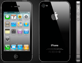
The new iPhone 4 designed by Apple is has, besides the  media player, the Internet web browser, e-mail, Wi-Fi connectivity, camera, also a video camera, video calling, Multitasking, and other new features that make it one of the most well sold electronic devices on the American market.

The iPhone 4 was design by Jonathan Ive, and it is different from the previous models. The outer face is black, and the screen occupies almost the entire surface of the iPhone. Due to the fact that there are so many pixels, the images are very bright and clear. As the other older versions, the phone is very thin compared to its length. It makes the user wonder where all the features are incorporated. Technology advances are taken their toll on us, and design is reaching a point that has never been seen before.

The video below presents the features of the new iPhone:

The color of the iPhone is black, and the visual balance of its surface is created by having the screen in the middle. Also, there is the same distance above and below the screen. The speaker and the menu button balance the weight. On the back side, the visual balance is created by the big apple and the words I-phone, and other small words, on the bottom. On the left hand side, there is the camera. The contrast between the black of the outside of the screen and the bright and vivid colors of the icons on the screen attract the eye, and make it easier for the users to read the information and look at the icons and images.

The iPhone 4 is the result of “play” of Jonathan Ive and his team, who were able to design and improves the older versions of the iPhone. This new innovation is the innovation in the design world and one of the greatest things the technology world has seen so far.

The video below presents the new iPhone 4 and its features:

Works Cited:
http://price-india.org/iphone-4-price-india-release-date/
http://www.youtube.com/watch?v=grTCDFbhKMU

Friday, October 29, 2010

Objectified - Form and Content

The movie Objectified is a documentary that sought to answer some of the big questions of design: what is designs, who are the people of design, what is the role of design in our society, and is design used mostly for commercial purposes, or does it have any other attributes? Designers from all over the world, interviewed to hear what they have to say about these questions. Most of them, agreed that for design to be successful, function always has to be above form. These two concepts are related however, and if they transmit a message, they form the concept. A design that looks good but is not functional, fails to achieve its purpose. Designers, deal every day with the obsession of making things that fit peoples’ needs and desires, things that are also aesthetically beautiful.
Some of the designers that were interviewed for this movie include:, Ewan Bourroulec, Chris Bangle (BMW), Paola Antonelli, Karim Rashin, Jonathan Ive (Apple), Naoto Fukasawa, and many other well-known designers. Even though their responses regarding design varied, they all agreed upon one thing: a designed object regardless of what it is, needs to create a unique experience for the user, and create a bond between the two.
Ewan Bourroulec, a French designer from Paris, came up with the idea for ergonomic chair design. He wanted to create an environment where people would feel good. So he looked at many different chairs, and chose the ones that best suited people with back pain. They were simple, but with a great function. The ergonomic chair is a great example that a design is not just about the aspect, the form, but about its practical application.
Chris Bangle, one of the designers for BMW said that a car is a personal expression, and the way it looks is very important for the owner. In the case of a car, the function is obviously critical, but the form is also important, because for the owner, the look of the car is like a personal expression.
In the movie Objectified, well-known designers from all around the world state their opinion regarding what the relationship between form and function should be in a successful design. Once again, function seems to be by far much more important than the form, but form is also important, and it can also be a way of self-expression for the owner.

Monday, October 18, 2010

Solar planes-Fossil Fuel Free Planes

An airplane that produces more energy than it consumes…an airplane that can fly around the world on solar energy, with no additional fuel, and pollution free. For now, that is just a dream of Bertrand Piccard and Andre Borscherg, the pioneers of Solar Impulse, a fuel free airplane.  These two men are the fonder of one of the greatest technological innovations in the history. It is estimated that in 2012, Solar planes will fly around the globe. In order for this to happen however, this brilliant team of engineers needs to figure out how to make it light enough and how to create photovoltaic cells to sustain its weight through the air.

In the morning of July 7th, 2010, the Solar Impulse took off from the Payerne airbase, in Switzerland, under the control of  Borscherg, and reached an altitude of 8700 meters: “(…) reached an altitude of 8,700 meters. With the help of its 12,000 solar panels built into its enormous 63.4 meter wing, its 400kg of batteries were fully charged during this long ascent”. Before the night occurred, the prototype descended for a short period of time, after which it continued its journey, until the following morning. Moreover, it produced power, as CEO Andre Borscherg states: “During the whole of the flight, I just sat there and watched the battery charge level rise and rise! Sitting in a plane producing more energy than it consumes is a fantastic feeling”. Creating a plane that supplies itself with fuel and that doesn’t require any additional power, is a good example of a sustainable alternative to the traditional planes, and not only. It is a great example of the fact that sustainability is possible.

The commitment and devotion of this team of engineers, is impressive. In an interview done by Design News, Claude Michael, head of the Solvay-Solar Impulse partnership: "In terms of technical constraints, the question is very simple," Michel told Design News. "We need a surface area of photovoltaic that delivers enough energy to put into the air a certain amount of weight. This is what we call the equation of the Solar Impulse. One square meter in photovoltaic delivers 30 watts, and with that 30 watts, we can put 8 kg (2.2 lb) in the air. This is our target, and it is an everyday obsession." (2)

Works Cited:
1.http://www.solarimpulse.com/common/documents/news_affich.php?lang=en&group=news&IdArticle=72
2 - http://www.designnews.com/article/511006-Solar_Plane_Takes_Flight.php  

Gap, one of the largest clothing retailers in the United States, recently had an attempt to change their logo. Their attempt caused a lot of controversy among GAP fans, showing their loyalty to the old design of the logo. But this controversy brought GAP on the first page of the newspapers and in the attention of the media, once again. In the past couple of years, the reputation of the brand decreased and consumers and fashion people seemed to have forgotten its value from the 90’s.                                       

The original logotype, simple and recognizable to anyone, contains the word GAP in capital letters, encased in a blue square. On their ends, the letters had decorative elements, called serifs. The new logo still retained the word GAP, but the blue square was replaced by a white square, with a blue square in the middle. The serifs were gotten rid of. After the protests and critics of thousands of people brought to the address of the new logo, the president of the GAP brand in North America, Marka Hansen came forward to say that “the outpouring of comments indicated that the company "did not go about this in the right way", and that the company decided to continue using the old logo.


In order to find out why the costumers didn’t approve the new GAP’s new brand logo, NeuroFocus, the world’s leading neuromarketing company, “went looking for the most accurate and reliable answers in the best place to find them: the deep subconscious level of the brain. The company conducted neurological testing of Gap customers to discover why the new execution failed to attract them — and in some cases earned negative reactions” (http://www.prnewswire.com/news-releases/brain-gap-neurofocus-study-reveals-what-went-wrong-with-the-gaps-new-brand-logo-105165954.html)

Dr. Pradeep, psychologist and the author of the new best-seller The Buying Brain: Secrets for Selling to the Subconscious Mind found that for a company’s brand to be successful, there are two things that need to be taken into consideration: “does the new design violate any Neurological Best Practices? And does the new design build upon the existing brand attributes that are identified through the Brand Essence Framework?”. GAP took advice, listened to the voice of its costumers and kept their original logo. At least for now.
  
Works Cited:


Design as a Conversation

In the 21st century, websites occupy a major part of our lives. As the most important source of information, and the primary way of getting in touch with the world around us, websites need to show aesthetic quality, professionalism, and have the ability to spark a conversation with the viewer. The very first thing we see when we load an internet page are the visual representations and their relationship to the other elements of the page. If in the past, quality and creativity of a web page was enough to attract readers, it seems that nowadays, rules have changed. We, the viewers, don’t accept to be treated as “it’s” anymore, but rather as humans. We want the internet page to communicate something to us, and not just to create a visual image. The web designs need to be strong enough to capture our interest and have the power to spark a conversation in transmitting their message, while keeping their aesthetics and professionalism. The New York Tiems is a good example:

Fig 1
In designing a Web page today, a connection needs to be established between the content of the page and the viewers.  As Darren Hoyt recently wrote in “Designing with Social Skills”, “Simply being ‘usable’ isn’t enough, no more than nice cars should be merely “drivable”. Ideally, a website should spark an interesting conversation the moment it loads”. A good web design needs to have visual unity. It is not only about the usefulness of a website anymore, but also about its power to establish a relationship (in the good sense of the word) between the topic presented and the readers: “It should usher you from page to page, telling great stories along the way. It shouldn’t come on too shy or too strong. It should look sharp without looking vain”.

                  Fig 1In designing interfaces, a conversation should be established between the web designer and the user. The user should be treated as a “friend”. Hoyt also shows that in the recent years, more and more internet pages use “Hello” instead of “Welcome”, as greeting, in order to personalize the conversation. The websites for Governmental institutions and companies where professionalism is crucial and needs to be maintained, other ways to connect with their viewers and communicate with them are necessary.
Works Cited