"Plans are only good intentions unless they immediately degenerate into hard work !"
(Peter Drucker)

Sunday, October 31, 2010

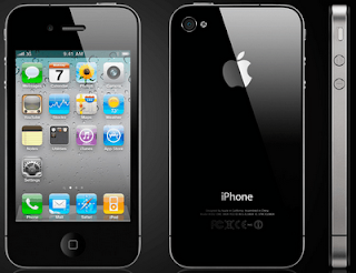
Apple iPhone 4

The new iPhone 4 designed by Apple is has, besides the  media player, the Internet web browser, e-mail, Wi-Fi connectivity, camera, also a video camera, video calling, Multitasking, and other new features that make it one of the most well sold electronic devices on the American market.

The iPhone 4 was design by Jonathan Ive, and it is different from the previous models. The outer face is black, and the screen occupies almost the entire surface of the iPhone. Due to the fact that there are so many pixels, the images are very bright and clear. As the other older versions, the phone is very thin compared to its length. It makes the user wonder where all the features are incorporated. Technology advances are taken their toll on us, and design is reaching a point that has never been seen before.

The video below presents the features of the new iPhone:

The color of the iPhone is black, and the visual balance of its surface is created by having the screen in the middle. Also, there is the same distance above and below the screen. The speaker and the menu button balance the weight. On the back side, the visual balance is created by the big apple and the words I-phone, and other small words, on the bottom. On the left hand side, there is the camera. The contrast between the black of the outside of the screen and the bright and vivid colors of the icons on the screen attract the eye, and make it easier for the users to read the information and look at the icons and images.

The iPhone 4 is the result of “play” of Jonathan Ive and his team, who were able to design and improves the older versions of the iPhone. This new innovation is the innovation in the design world and one of the greatest things the technology world has seen so far.

The video below presents the new iPhone 4 and its features:

Works Cited:
http://price-india.org/iphone-4-price-india-release-date/
http://www.youtube.com/watch?v=grTCDFbhKMU

Friday, October 29, 2010

Objectified - Form and Content

The movie Objectified is a documentary that sought to answer some of the big questions of design: what is designs, who are the people of design, what is the role of design in our society, and is design used mostly for commercial purposes, or does it have any other attributes? Designers from all over the world, interviewed to hear what they have to say about these questions. Most of them, agreed that for design to be successful, function always has to be above form. These two concepts are related however, and if they transmit a message, they form the concept. A design that looks good but is not functional, fails to achieve its purpose. Designers, deal every day with the obsession of making things that fit peoples’ needs and desires, things that are also aesthetically beautiful.
Some of the designers that were interviewed for this movie include:, Ewan Bourroulec, Chris Bangle (BMW), Paola Antonelli, Karim Rashin, Jonathan Ive (Apple), Naoto Fukasawa, and many other well-known designers. Even though their responses regarding design varied, they all agreed upon one thing: a designed object regardless of what it is, needs to create a unique experience for the user, and create a bond between the two.
Ewan Bourroulec, a French designer from Paris, came up with the idea for ergonomic chair design. He wanted to create an environment where people would feel good. So he looked at many different chairs, and chose the ones that best suited people with back pain. They were simple, but with a great function. The ergonomic chair is a great example that a design is not just about the aspect, the form, but about its practical application.
Chris Bangle, one of the designers for BMW said that a car is a personal expression, and the way it looks is very important for the owner. In the case of a car, the function is obviously critical, but the form is also important, because for the owner, the look of the car is like a personal expression.
In the movie Objectified, well-known designers from all around the world state their opinion regarding what the relationship between form and function should be in a successful design. Once again, function seems to be by far much more important than the form, but form is also important, and it can also be a way of self-expression for the owner.

Monday, October 18, 2010

Solar planes-Fossil Fuel Free Planes

An airplane that produces more energy than it consumes…an airplane that can fly around the world on solar energy, with no additional fuel, and pollution free. For now, that is just a dream of Bertrand Piccard and Andre Borscherg, the pioneers of Solar Impulse, a fuel free airplane.  These two men are the fonder of one of the greatest technological innovations in the history. It is estimated that in 2012, Solar planes will fly around the globe. In order for this to happen however, this brilliant team of engineers needs to figure out how to make it light enough and how to create photovoltaic cells to sustain its weight through the air.

In the morning of July 7th, 2010, the Solar Impulse took off from the Payerne airbase, in Switzerland, under the control of  Borscherg, and reached an altitude of 8700 meters: “(…) reached an altitude of 8,700 meters. With the help of its 12,000 solar panels built into its enormous 63.4 meter wing, its 400kg of batteries were fully charged during this long ascent”. Before the night occurred, the prototype descended for a short period of time, after which it continued its journey, until the following morning. Moreover, it produced power, as CEO Andre Borscherg states: “During the whole of the flight, I just sat there and watched the battery charge level rise and rise! Sitting in a plane producing more energy than it consumes is a fantastic feeling”. Creating a plane that supplies itself with fuel and that doesn’t require any additional power, is a good example of a sustainable alternative to the traditional planes, and not only. It is a great example of the fact that sustainability is possible.

The commitment and devotion of this team of engineers, is impressive. In an interview done by Design News, Claude Michael, head of the Solvay-Solar Impulse partnership: "In terms of technical constraints, the question is very simple," Michel told Design News. "We need a surface area of photovoltaic that delivers enough energy to put into the air a certain amount of weight. This is what we call the equation of the Solar Impulse. One square meter in photovoltaic delivers 30 watts, and with that 30 watts, we can put 8 kg (2.2 lb) in the air. This is our target, and it is an everyday obsession." (2)

Works Cited:
1.http://www.solarimpulse.com/common/documents/news_affich.php?lang=en&group=news&IdArticle=72
2 - http://www.designnews.com/article/511006-Solar_Plane_Takes_Flight.php  

Gap, one of the largest clothing retailers in the United States, recently had an attempt to change their logo. Their attempt caused a lot of controversy among GAP fans, showing their loyalty to the old design of the logo. But this controversy brought GAP on the first page of the newspapers and in the attention of the media, once again. In the past couple of years, the reputation of the brand decreased and consumers and fashion people seemed to have forgotten its value from the 90’s.                                       

The original logotype, simple and recognizable to anyone, contains the word GAP in capital letters, encased in a blue square. On their ends, the letters had decorative elements, called serifs. The new logo still retained the word GAP, but the blue square was replaced by a white square, with a blue square in the middle. The serifs were gotten rid of. After the protests and critics of thousands of people brought to the address of the new logo, the president of the GAP brand in North America, Marka Hansen came forward to say that “the outpouring of comments indicated that the company "did not go about this in the right way", and that the company decided to continue using the old logo.


In order to find out why the costumers didn’t approve the new GAP’s new brand logo, NeuroFocus, the world’s leading neuromarketing company, “went looking for the most accurate and reliable answers in the best place to find them: the deep subconscious level of the brain. The company conducted neurological testing of Gap customers to discover why the new execution failed to attract them — and in some cases earned negative reactions” (http://www.prnewswire.com/news-releases/brain-gap-neurofocus-study-reveals-what-went-wrong-with-the-gaps-new-brand-logo-105165954.html)

Dr. Pradeep, psychologist and the author of the new best-seller The Buying Brain: Secrets for Selling to the Subconscious Mind found that for a company’s brand to be successful, there are two things that need to be taken into consideration: “does the new design violate any Neurological Best Practices? And does the new design build upon the existing brand attributes that are identified through the Brand Essence Framework?”. GAP took advice, listened to the voice of its costumers and kept their original logo. At least for now.
  
Works Cited:


Design as a Conversation

In the 21st century, websites occupy a major part of our lives. As the most important source of information, and the primary way of getting in touch with the world around us, websites need to show aesthetic quality, professionalism, and have the ability to spark a conversation with the viewer. The very first thing we see when we load an internet page are the visual representations and their relationship to the other elements of the page. If in the past, quality and creativity of a web page was enough to attract readers, it seems that nowadays, rules have changed. We, the viewers, don’t accept to be treated as “it’s” anymore, but rather as humans. We want the internet page to communicate something to us, and not just to create a visual image. The web designs need to be strong enough to capture our interest and have the power to spark a conversation in transmitting their message, while keeping their aesthetics and professionalism. The New York Tiems is a good example:

Fig 1
In designing a Web page today, a connection needs to be established between the content of the page and the viewers.  As Darren Hoyt recently wrote in “Designing with Social Skills”, “Simply being ‘usable’ isn’t enough, no more than nice cars should be merely “drivable”. Ideally, a website should spark an interesting conversation the moment it loads”. A good web design needs to have visual unity. It is not only about the usefulness of a website anymore, but also about its power to establish a relationship (in the good sense of the word) between the topic presented and the readers: “It should usher you from page to page, telling great stories along the way. It shouldn’t come on too shy or too strong. It should look sharp without looking vain”.

                  Fig 1In designing interfaces, a conversation should be established between the web designer and the user. The user should be treated as a “friend”. Hoyt also shows that in the recent years, more and more internet pages use “Hello” instead of “Welcome”, as greeting, in order to personalize the conversation. The websites for Governmental institutions and companies where professionalism is crucial and needs to be maintained, other ways to connect with their viewers and communicate with them are necessary.
Works Cited

Monday, October 11, 2010

Lampo Leong - Chinese Painter and Calligrapher

         Image 1
Lampo Leong is a well-known Chinese painter and calligrapher, currently Professor of Art in Painting and Drawing at the University of Missouri, Columbia. In a recent presentation at UC Davis, Professor Leong explained the reasons that determined him to do research on the ‘Omega Curve‘, the use, and the tremendous importance of this shape. The Omega curve, Professor Leong said “is an important common shape, related to grandeur and loftiness (sublime) in visual art.”
                                                                                                   Fig 2
The author of the book “Visual Forces of the ‘Omega Curve‘”, (book that is about to come out in Chinese for now), Professor Leong talks about his research and his findings related to the ‘Omega Curve‘. This shape, he states, “has a
majestic and heroic power”, and it is a stylistic pattern that can be found all throughout history of art and architecture. Artists and architects in every culture and every period of time turned to this shape to create movement and dynamism in their works. The Greeks, the Romans, North European artists, as well as Chinese and Japanese artists and calligraphers used ‘Omega Curve’ to bring life to their art creations. Consciously ot unconsciously, this technique seems to have been employed even by Michelangelo in the ceiling of the Sistine Chapel.
Fig 3
Like in other arts - painting, drawing, or design-, Professor Leong explained, in caligraphy too, ‘Omega Curve’ plays a significant role, giving it continuity and rhythm by making the linkage between characters. He mentioned that calligraphy can be either correct, or just bad calligraphy. Correct calligraphy involves the correct use of lines and patterns, and a smooth transition from one character to the next.

One of Lampo Leong's major art works as a calygrapher, was the floor seal for the Who Hei Yuen park in China Town in San Francisco.
 At the end of his presentation, Professor Leong, amazed his audience with a demonstration of calligraphy. Smooth brush, dipped in black ink, he quickly points the tip of the brush on the rice paper, and then the show begins. He quickly makes wide and narrow marks on the paper, moving his body at the same pace with his brush. “When you are doing calligraphy, you need to transcend the energy from yourself into the brush, and from there into the paper!“|he explained.


Works Cited:
Fig 3 http://www.cedcc.psu.edu/khanjan/europe_images/025_sistine%20chapel.jpg

Artists Who Found Inspiration From Without

Andy Goldsworthy is a British artist who, unlike many of his contemporaries, turned to nature, to seek ideas and inspiration. He creates most of his works in open air- forests, mountains, hills, plains, lakes, and rivers- using as materials the natural elements that the site provides him with: leaves, flowers, ice, snow, stones, bark, clay, wood. To explore, observe and better understand the natural world and its deepest secrets, Goldsworthy does a lot of traveling around the world. He has been to places such as Canada, Australia, the North Pole, United States, and many others. His goal is not to mark the landscape permanently, but rather to work with it and create, though ephemeral, memorable scenes. Because the majority of his creations are meant to last only for a short period of time, Goldsworthy records them through photographs, before they vanish.


Goldsworthy’s collaboration with nature is perfect. He creates balance among the natural elements, assuring, in the meantime harmony between the viewer and the nature. No matter how simple some of his artworks might seems at a first glance, if you take a closer look, you can see that they are complex, emanating energy and incorporating a lot of movement. A challenge that he faces, is the fact that seasons change, and weather is not a sure thing. Over time, due to the climatic conditions, such as heat, cold, or winds, most of his works dssapear, but he has the power and will to start it all over again: "Nature is in a state of change and that change is the key to understanding. I want my art to be sensitive and alert to changes in material, season and weather. Each work grows, stays, decays. Process and decay are implicit. Transience in my work reflects what I find in nature." (Andy Goldsworthy)

The idea of balance is mostly visible in Balanced Rock, one of the most well-known works of Goldsworthy. The image below amazes every viewer and it doesn't need any further explanation. 

Image 1


Other famous works include of Andy Goldsworhty include: "Sits cut into frozen snow stormy strong wind","The wall", "The wall that went for a walk", "Slate arch made over two days, fourth attempt", "Oak leaves in holls".

For more information on the biography and work of Andy Goldworhty :  http://www.rwc.uc.edu/artcomm/web/w2005_2006/maria_Goldsworthy/works.html


Work Cited:
http://www.morning-earth.org/artistnaturalists/an_goldsworthy.html
Picture 1 - http://www.rwc.uc.edu/artcomm/web/w2005_2006/maria_Goldsworthy/works.html

STONE SOUP


Stone Soup is a fable, an old folk tale, whose interpretation varies from culture to culture. Even though different parts of the world have different versions of the story, its moral lesson is universal. When more people come together, each bringing their contribution, there is a good chance that something great is going to come out. In design too, cooperation is the key to success, and sharing is many times, not giving, but rather receiving. Also you don’t need a lot to create something wonderful, you just need to be open minded, and willing to work with others and show a morally correct behavior.


In one of the versions of Stone Soup a hungry stranger comes into a village to ask people for food. Because nobody is willing to share their goods, the man start making stone soup. He puts water in the pot he was carrying with them, throws a stone in, and puts the boiling pot in the main square of the village. A curious villager walks by, wondering what the traveler is doing. When asked, he responds that he is making “Stone Soup”, a very delicious dish, but which still needs something in order to have more flavor. The villagers then jumps in with an ingredient that gets added to the soup. Following him, more and more people bring something for the soup. At the end, the initial “Stone Soup” becomes a wonderful dish, that the whole village share and enjoys together.

The villagers are a good example of the fact that sometimes it just takes one person to take the initiative, and the rest will follow. Stone Soup provides us with a lesson worth keeping in mind: when more people work together in cooperation, they are more likely to succeed than they are if working individually. Design is all about working together, helping each other out, and standing up for each other. Also sometimes is good to just throw an idea to the table, even if it is not brilliant. Other people might jump in and contribute with their ideas, and Stone Soup will be made once again.


Works Cited

McGovern,Ann. Stone Soup. Scholastic Inc., New York, NY. 1986.
Video from http://www.youtube.com/watch?v=KvUKvYWO8Ic
http://www.google.com/imgres?imgurl=http://goldbabygraphics.files.wordpress.com/2009/01/stonesoup_logo1.jpg%3Fw%3D400%26h%3D284&imgrefurl=http://goldbabygraphics.wordpress.com/&usg=__HdZoJcUmb-VlT5I_tGi_QhJeb-I=&h=284&w=400&sz=19&hl=en&start=173&sig2=-pgnjlONeoWctpZfybLsow&zoom=1&tbnid=YfcSlDBW4b-jiM:&tbnh=117&tbnw=165&ei=YuyzTL6vIZTEsAPupLT-Bw&prev=/images%3Fq%3Ddesign%2Band%2Bstone%2Bsoup%26hl%3Den%26biw%3D1276%26bih%3D421%26gbv%3D2%26tbs%3Disch:1&itbs=1&iact=rc&dur=281&oei=aOuzTN5KjaywA6Ww7JII&esq=2&page=13&ndsp=14&ved=1t:429,r:8,s:173&tx=83&ty=56

Monday, October 4, 2010

Backpack design...a long lasting memory...!

Design is everywhere and it doesn't have limits or age. Even though styles change over time, and new trends come into picture, a design never gets old, but rather it stands out because it is different. We first come into contact with design right after we are born, but we just don't have the ability to recollect those memories.

My first vivid memory of my encounter with a designed object is my first backpack. I got it when I was seven, and even though so much time has passed since then, I still remember every single aspect and detail of it. It was square shaped, and probably bigger than I was at the time. Maybe I am exagerating a little here, but it was definitely a big one. It was made out of plastic,and on each side there were two red "cat eyes", made out of reflective material.


The reason I was attracted to this backpack from the begining, it was because of its color and design. On the outside, as well as on the inside, the alternating bright and dark colors were creating a contrast that captured my eyes from the moment I saw it in the store. Its vivid blue, very bright background made the figurines and cartoon characters painted on it, stand out. Yellow, pink, red, green and purple cats, dogs and other animals had a 3D appearence. On the left side, there was the cat Tom, chasing Jerry, the mouse, from Tom and Jerry, two characters that filled my childhood with joy. On the top part of the backpack, Snow White was surrounded by the Seven Dwarfs. In the middle, there were two fluorescent cat eyes, providing safety for the night time. The animals inscriptioned on the backpack, were meant to bring students closer to the Disney World, giving at the same time, a lesson about how important it is to appreciate the animals and protect them. Design here blends together, in a very successful manner, beauty and usefullness.

On the inside, the backpack contained a pencil box, a little wallet, and a lunch box. It was designed not only for carrying school supplies, but serve other needs as well. The color on the inside was a yellow that brightened up my life from the moment I got the backpack until the memont I decided to get rid of it, by the consideration that I was too old for so many colors and cartoon characters. It didn't take me long after to realize that giving it away was a big mistake.

The design of the backpack with its shape, multitude of colors, figurines, and Disney characters was very well thought through. It created a balance between school elements and fun. It was perfectly suited for a first grader,whose mind was at the cartoon characters, rather than at school. My first backpack is an example of the fact that design is everywhere and, as a matter of fact, is very powerful. From the day we are born, we are exposed to designs of all kinds, many times, we are not even aware of it. Sometimes, a shape, a color, or a pattern, captures our eyes for just a moment...other times...it marks us forever!           

Sunday, October 3, 2010

Design...a paradox


Design … Wherever we look, there is something that can be associated with this word, in one way or another. When we look at something, either a structure, building, or object, we say to ourselves that we like its design. But the question is “What exactly is design?”  What can be categorized as a design and what cannot be included in this category?  By searching the web, one can find all kinds of definitions for the word “design”. Merriam Webster Dictionary, for example to "design" is to "create, fashion, execute, or construct according to a plan", "to concve and plan out in mind", "to devise for a specific function or end". To define "design" however, we need to turn back the page of time, and look at the etymology of the word. In the article “The Etymology of Design: Pre-Socratic Perspective”, the author Kostas Terzidis explains in detail the origins and meaning of "design",  as well as what the word has come to mean today. Prepare yourself for a philosophy lesson! As simple as it sounds, understanding the meaning of the word “design” requires serious thinking.
In Latin, design is formed using the preposition “de” and the word “signare”, which means “to sign”, or “to mark”. Following this definition, one can reach to the conclusion that design is something signed, or something that has a mark on it. In Greek, “design” comes from “schedon”, which means “near, approximately, almost”, suggesting that design refers to something being incomplete, imperfect, never ending. But wait! Isn’t design supposed to be about completeness, order, relationship, harmony, perfection, and true beauty? And if you do think like that, you are not wrong. In the Western World, we have come to see and think of design as the greatest form of art, the true and sublime beauty.
If we dig even deeper into its Greek origins, we are going to find unexpected results. The word “schedon” derives from the word “eschein” (the past tense of “eho”), which means “to have”, or “to posses”. On this basis, if translated into English, design means something we had in the past, but that now is all gone. What..You would say, design is part of the past? And you are right once again. Today we talk about design as being something that leads us towards the future, something that outstands time, something new and creative  that has never been heard of, nor seen before.
This paradox created by the etymology of “design” and what our society perceives “design” to be and look like, is further developed by Terzidis in his article. He goes further to argue that innovation and novelty don’t have the same meaning, even though they both refer to something new. Also existence doesn't necessarily mean the begining of something, but it could also mean the transition from one state to another.


Work Cited Page
  • Terzidis, Kostas. The Etymology of Design: Pre-Socratic Perspectives. Massachusetts Institute  of  Technology,Volume 23, Number 4: 2007.

Friday, October 1, 2010

The Merry Cemetery

Not too many times you see people laughing and having a good time in a cemetery. There is a place however, where this actually happens. The small village of Sapanta, Maramures county, Romania, is known worldwide for its unique cemetery - The Merry Cemetery. The name comes from the colorful tombstones that depict the persons who were buried there, in a very unusual and unique manner. The design of the thousands of crosses, very colorful, and containing poetry and lyrics, arouses the interest and amusement of the tourists. The major purpose is to remind us that even though death is inevitable, our souls never die, but rather they rise to a better place.


Ioan Patras, the founder of the cemetery, was a sculptor, painter, and poet. Using all his artistic skills, in the 1930's, he started carving crosses. At the beginning, his passion was just an experiment. Then, as the word got out, more and more people became interested in his work.

The crosses, made out of wood, are all carved by hand. Once all the carving is done, the background is painted blue. When dry, other colors are added, to give it a playful look. Each cross has two main features: a painted scene from the life of the deceased, located on the top, and a short poem, down on the bottom. The upper painting usually represents a scene from the life of the person buried there. It could be his work, him being out in the field, or playing with his children.  The poem starts off with the pronoun “I”, giving us the impression that the deceased is filling us in with the good or bad things he has done in his life, or how his death occurred. This information is usually expressed in a satiric or ironic manner. Through the poetry, the dead is able to send messages to their living families and friends, and therefore he will always be remembered...!

If it wasn't for the colorful and unusual design of the tombstones and crosses, The Merry Cemetery at Sapanta would induce, like any other cemetery, sobriety and sadness. The vivid colors, the pictorial scenes, and the poetry and lyrics added on the cross, give the place a note of amusement, and create good disposition among the visitors!